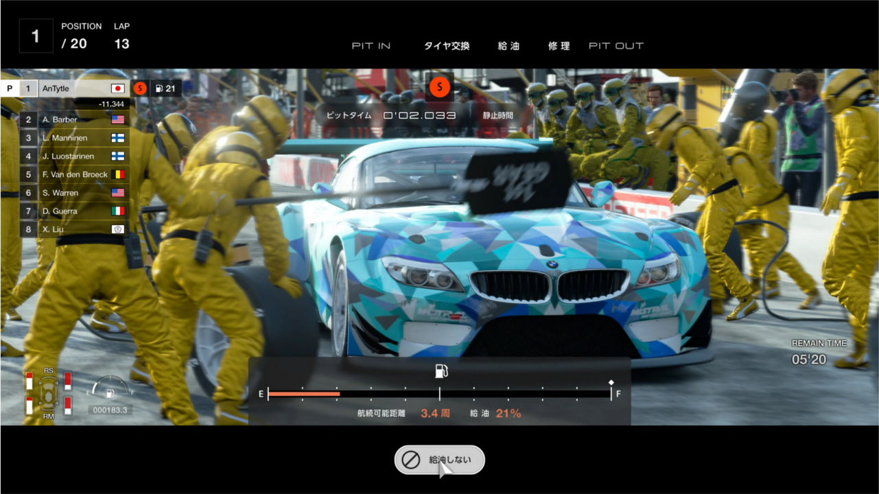
GTSPORTで90度超えドリフトをする方法
<!DOCTYPE html>
<html>
<head>
<meta charset="utf-8">
<style>
* {
  margin: 0;
  padding: 0;
}
html,
body {
  width: 100%;
  height: 100%;
}
.smashbros {
  background: radial-gradient(#00A3E9, #1936BA);
  position: relative;
  width: 100%;
  height: 100%;
}
.smashbros:before {
  background: #000;
  content: '';
  position: absolute;
  top: -140px;
  left: -10%;
  transform: rotate(-3deg);
  width: 120%;
  height: 200px;
}
.smashbros:after {
  background: #000;
  content: '';
  position: absolute;
  bottom: -140px;
  left: -10%;
  transform: rotate(-3deg);
  width: 120%;
  height: 200px;
}
.smashbros-text {
  font-size: 9em;
  font-weight: bold;
  line-height: 1.1;
  -webkit-perspective: 500;
  position: absolute;
  bottom: .5em;
  left: .4em;
  z-index: 4;
}
.smashbros-white {
  color: #fff;
  text-shadow: -4px 4px 0 #000;
  transform: rotateY(24deg);
}
.smashbros-yellow {
  background: linear-gradient(#F9E000, #FFA400);
  -webkit-background-clip: text;
  -webkit-text-fill-color: transparent;
  transform: rotateY(24deg);
}
.smashbros-char {
  position: absolute;
  bottom: -45%;
  right: -20px;
  z-index: 3;
  width: 50%;
  min-width: 600px;
}
.smashbros-char img {
  width: 100%;
}
</style>
</head>
<body>
<div class="smashbros">
  <div class="smashbros-text"><div class="smashbros-white">ネス</div><div class="smashbros-yellow">参戦!!</div></div>
  <div class="smashbros-char"><img src="http://img.antytle.com/codeui/smash_ness_png.png"></div>
</div>
</body>
</html>
今回は「大乱闘スマッシュブラザーズ SPECIAL」の新キャラを入手した時に表示される画面を、HTML/CSSで再現したいと思います。ベンダープリフィックスを必要とする先進のコードも使っているので、中級者以上の記事となります。

円形グラデーションはbackgroundにradial-gradientを使って表現します。
.smashbros {
  background: radial-gradient(#00A3E9, #1936BA);
  position: relative;
  width: 100%;
  height: 100%;
}
上下の黒帯は擬似要素(beforeとafter)を使って表現していきます。smashbrosクラス要素に対してposition:absolute;をかけ、それぞれtopとbottomで上下に黒帯をつけます。このままでは平行な帯のままなので、transform: rotate(-3deg);として傾けます。
.smashbros:before {
  background: #000;
  content: '';
  position: absolute;
  top: -140px;
  left: -10%;
  transform: rotate(-3deg);
  width: 120%;
  height: 200px;
}
.smashbros:after {
  background: #000;
  content: '';
  position: absolute;
  bottom: -140px;
  left: -10%;
  transform: rotate(-3deg);
  width: 120%;
  height: 200px;
}
.smashbros-text {
  font-size: 9em;
  font-weight: bold;
  line-height: 1.1;
  -webkit-perspective: 500;
  position: absolute;
  bottom: .5em;
  left: .4em;
  z-index: 4;
}
.smashbros-yellow {
  background: linear-gradient(#F9E000, #FFA400);
  -webkit-background-clip: text;
  -webkit-text-fill-color: transparent;
  transform: rotateY(24deg);
}
テキストにグラデーションをかけるには、-webkit-background-clip: text;と-webkit-text-fill-color: transparent;を使って表現します。
文字に奥行きをつけるには親要素に-webkit-perspective: 500;を、子要素にtransform: rotateY(24deg);をつけて実装します。
CSS
.smashbros-text {
  font-size: 9em;
  font-weight: bold;
  line-height: 1.1;
  -webkit-perspective: 500;
  position: absolute;
  bottom: .5em;
  left: .4em;
  z-index: 4;
}
.smashbros-white {
  color: #fff;
  text-shadow: -4px 4px 0 #000;
  transform: rotateY(24deg);
}
.smashbros-yellow {
  background: linear-gradient(#F9E000, #FFA400);
  -webkit-background-clip: text;
  -webkit-text-fill-color: transparent;
  transform: rotateY(24deg);
}
HTML
<div class="smashbros-text">
  <div class="smashbros-white">ネス</div>
  <div class="smashbros-yellow">参戦!!</div>
</div>

うまく完成したでしょうか。今回のような画面全体を使ったレイアウトは、普通のメディアサイトを作るより難易度が高いです。さらにベンダープリフィックスを使用した先進技術も使用しているので、戸惑った方も多いと思います。CSSで3D表現を実装することも新鮮ですね。しかしこれらの先進のコードは、まだ開発段階の技術ゆえ、仕事の場面ではまず使うことはないでしょう。こんなこともできるんだと言う好奇心を持ってもらえたら幸いです。